Business balance for creative chaos
StreamtimeNB Studio, 2025
Full credits
StudioNB Studio, 2025
Creative directionNick FinneyCleber de Campos
Project teamCleber de CamposAlice ReaJames MirLucy DaviesSophie KnowlesRhiannon Hayes-Drury
CollaboratorsKoysor Abdul (website coder)
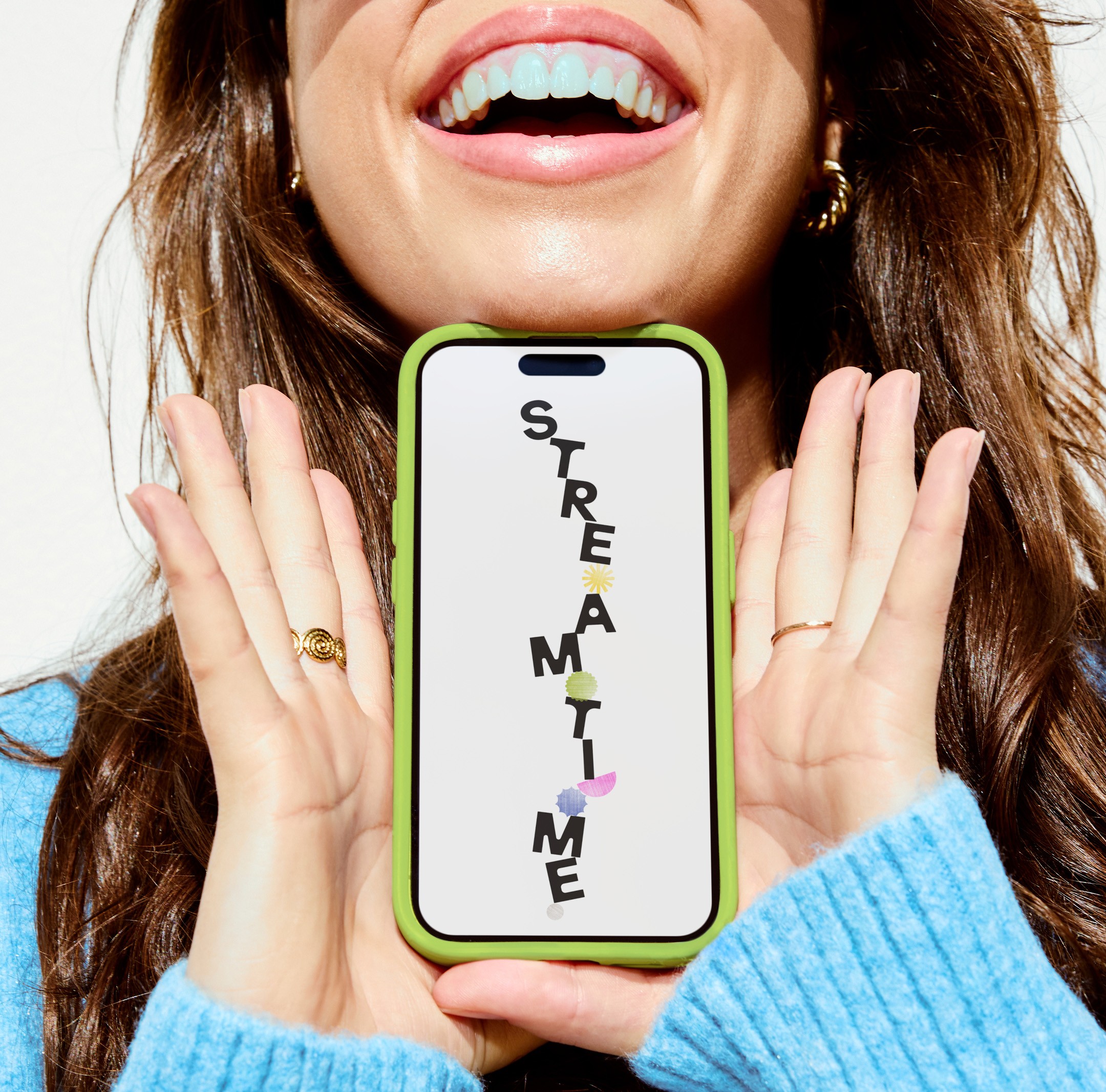
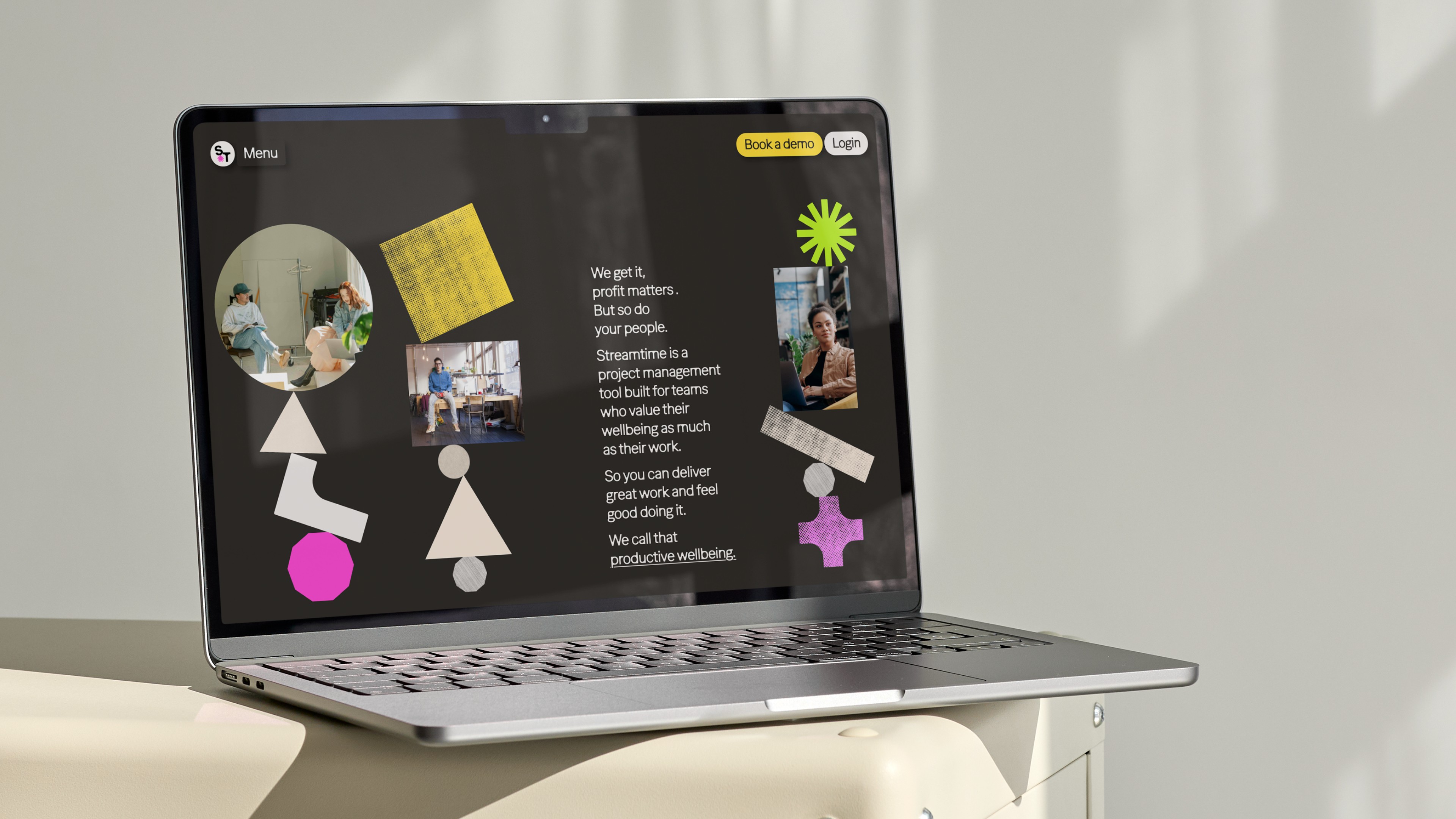
Unlike competitors who treat wellbeing as an add-on, project management software Streamtime places it at the core of its product. Since 2002, they’ve been rethinking timesheets—transforming them into intuitive to-do lists made for creatives. With their new strategy, Productive Wellbeing – feeling good while doing great work – Streamtime partnered with NB to rebrand, embracing the tension between productivity and wellbeing while celebrating imperfection over polish.
Rooted in the imperfect balance about creativity and commercial realities, the idea of Business Balance for Creative Chaos shaped a distinct tone of voice—paradoxical, playful, and true to Streamtime’s original humour.
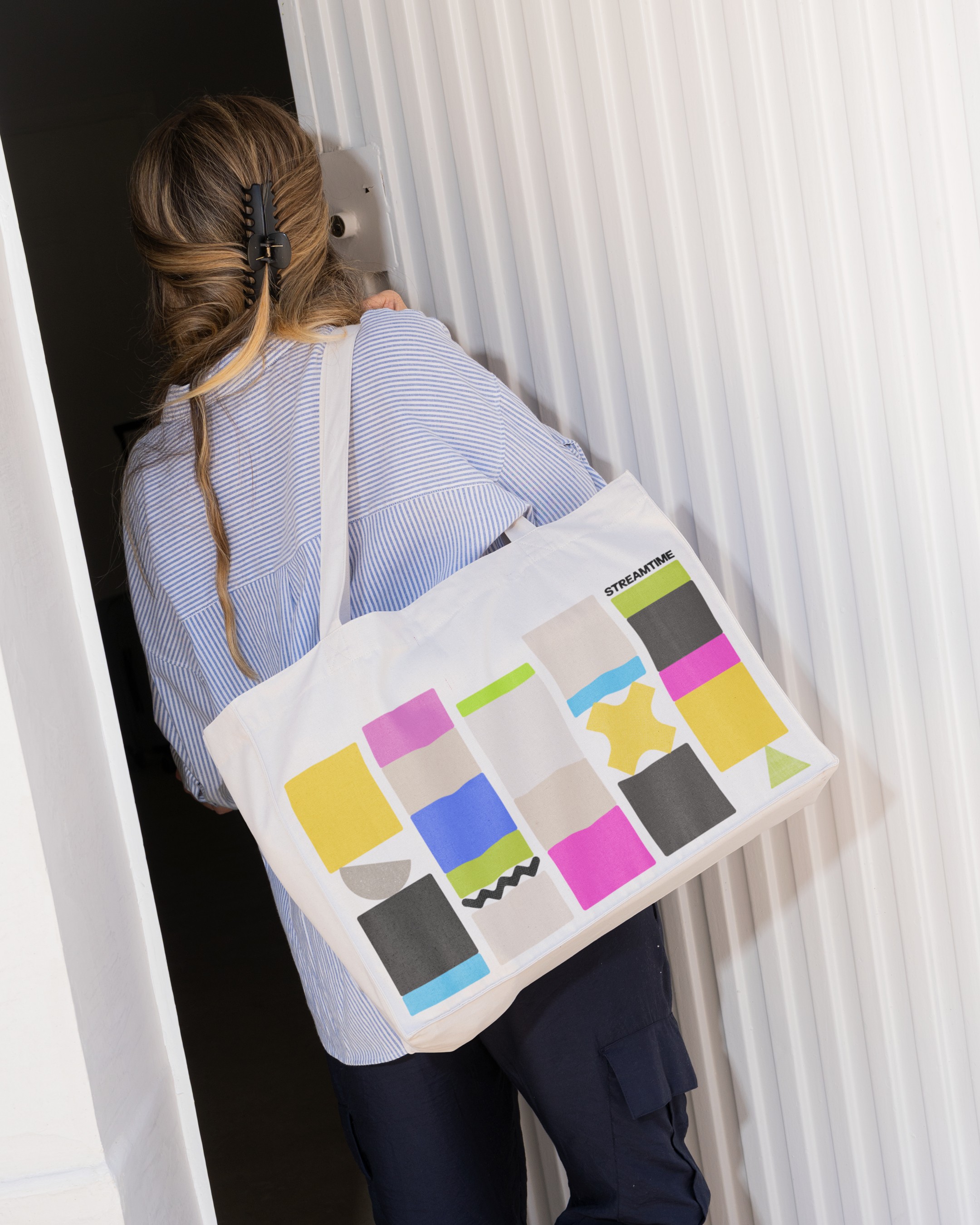
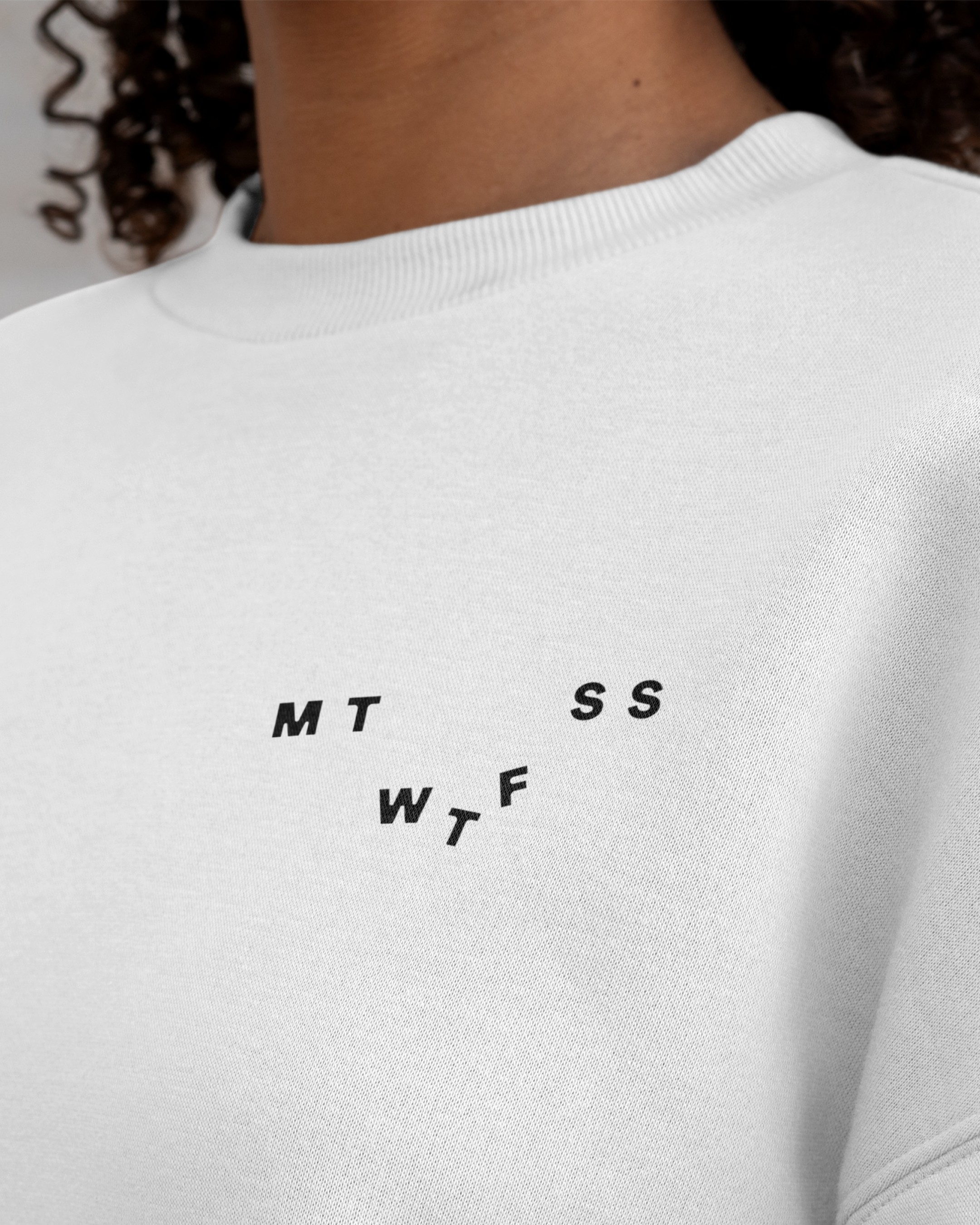
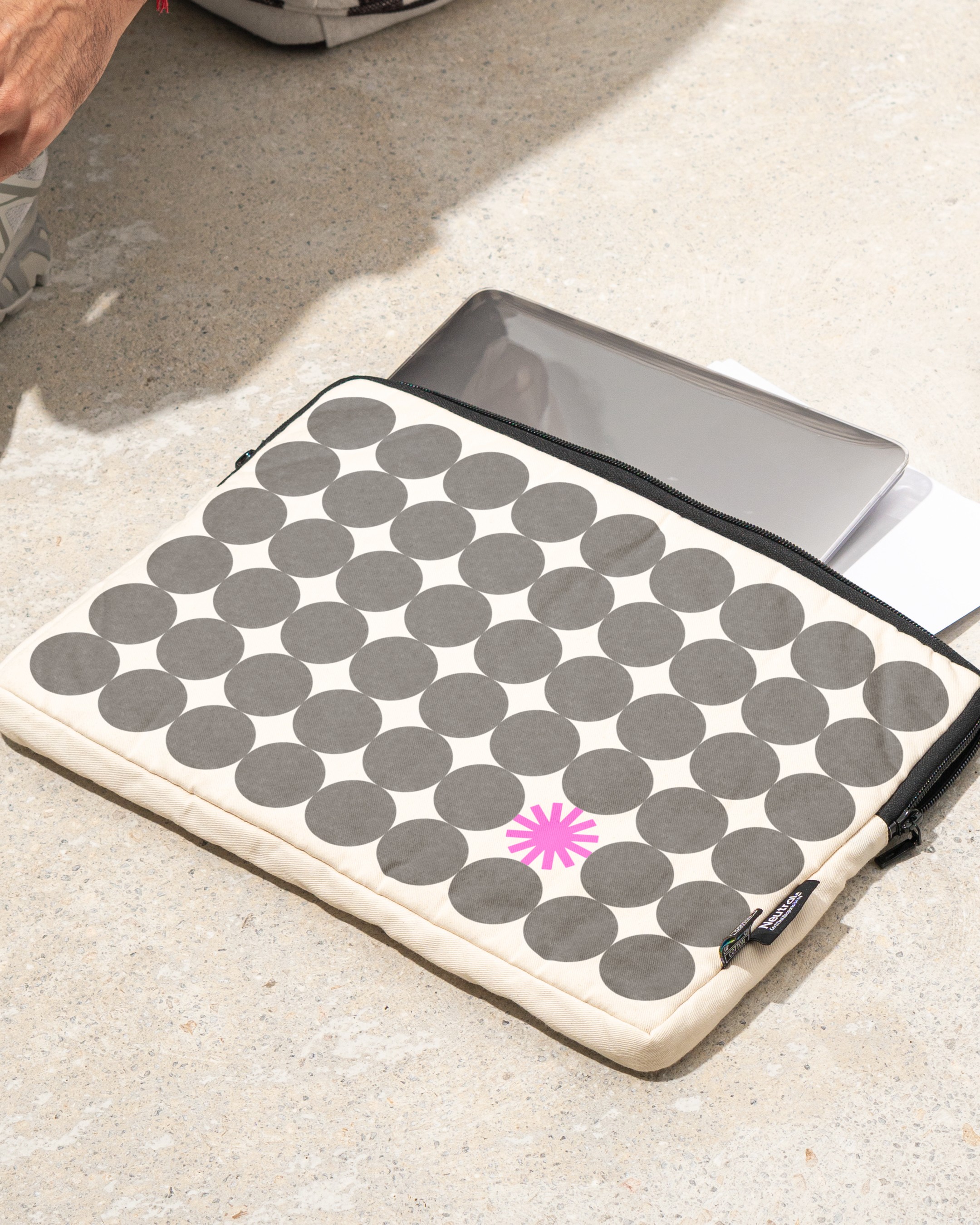
The new identity expresses this philosophy through dynamic, tactile shapes inspired by the interface and influenced by the Kiki/Bouba effect. Seven core shapes – one for each day – reflect creative highs and lows, evolving into expressive icons and playful “emo-shapes”, that come to life with micro interactions, tilting, wobbling and falling across the website. Rejecting rigid perfection, the brand embraces gritty textures, broken grids, and bold overlays—celebrating creative chaos with balance, humour, and heart.
Full case study on NB Studio website.
Other Projects

Noï
→

Rolls-Royce
→
Natural History Museum
→
Contact


Business balance for creative chaos
StreamtimeNB Studio, 2025
Full credits
StudioNB Studio, 2025
Creative directionNick FinneyCleber de Campos
Project teamCleber de CamposAlice ReaJames MirLucy DaviesSophie KnowlesRhiannon Hayes-Drury
CollaboratorsKoysor Abdul (website coder)
Unlike competitors who treat wellbeing as an add-on, project management software Streamtime places it at the core of its product. Since 2002, they’ve been rethinking timesheets—transforming them into intuitive to-do lists made for creatives. With their new strategy, Productive Wellbeing – feeling good while doing great work – Streamtime partnered with NB to rebrand, embracing the tension between productivity and wellbeing while celebrating imperfection over polish.
Rooted in the imperfect balance about creativity and commercial realities, the idea of Business Balance for Creative Chaos shaped a distinct tone of voice—paradoxical, playful, and true to Streamtime’s original humour.
The new identity expresses this philosophy through dynamic, tactile shapes inspired by the interface and influenced by the Kiki/Bouba effect. Seven core shapes – one for each day – reflect creative highs and lows, evolving into expressive icons and playful “emo-shapes”, that come to life with micro interactions, tilting, wobbling and falling across the website. Rejecting rigid perfection, the brand embraces gritty textures, broken grids, and bold overlays—celebrating creative chaos with balance, humour, and heart.
Full case study on NB Studio website.
Other Projects
Noï
→
Rolls-Royce
→
Natural History Museum
→
Contact